Map vectorisation with python
- 6 minutes read - 1140 wordsHi All,
After a while between posts I thought it would be interesting to talk about image classification and its application to scanned geological maps.
GSWA has many many 1:250K and 1:100K maps where the only digital version is a scanned print, which depending on your use case might be ok but for machine learning and targeting leave a little to be desired.
So let’s discuss a few methods of converting these scanned maps into vector datasets or at least a sensible raster representation.
As usual for those that would like to play along at home or work I’m providing the code and data, but before we get too carried away you’ll need to install these libraries.
pip install sklearn catboost scikit-image matplotlib imageio
First lets download a .json file in the labelMe format which I’ve tagged the units of the geological column and the outlined a randomly selected area to test on and the scanned map from DMIRS.
import urllib.request
import urllib.parse

import urllib.request
from pathlib import Path
import urllib.parse
import shutil
import json

url = 'http://www.fractalgeoanalytics.com/articles/mapvectorisationwithpython.files/Collie_si5006_Geol_MGA.json'
outpath = Path('data')
outfile = outpath.joinpath('Collie_si5006_Geol_MGA.json')
# check if the folder exists if not make it
if not outpath.exists():
    outpath.mkdir()


user_agent = 'Mozilla/5.0 (Windows NT 6.1; Win64; x64)'
headers = {'User-Agent': user_agent}
def download_file(url, headers,outfile):
    # download the .json file
    req = urllib.request.Request(url=url, headers=headers)
    if not outfile.exists():
        with urllib.request.urlopen(req) as response:
            the_page = response.read()
            with open(outfile,'wb') as file:
                file.write(the_page)
        print(f'{outfile} has been saved!')
    else:
        print(f'{outfile} already exists!')

# download the .json
download_file(url, headers,outfile)

# now we will load the .json file and download the file from the url at DASC
with open(outfile,'r') as file:
    data = json.load(file)

url_map = 'https://dasc.dmirs.wa.gov.au/Download/File/1505'
outmap = outpath.joinpath('Collie_si5006_Geol_MGA_jp2.zip')
# download the scanned map
download_file(url_map, headers, outmap)

# unzip the downloaded map
shutil.unpack_archive(outmap,outpath)
So the first method we are going to try is to directly convert the .jpg to vector using qgis as an experiment.
First let’s look at the test section
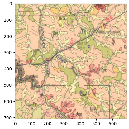
And just directly vectorise the image.
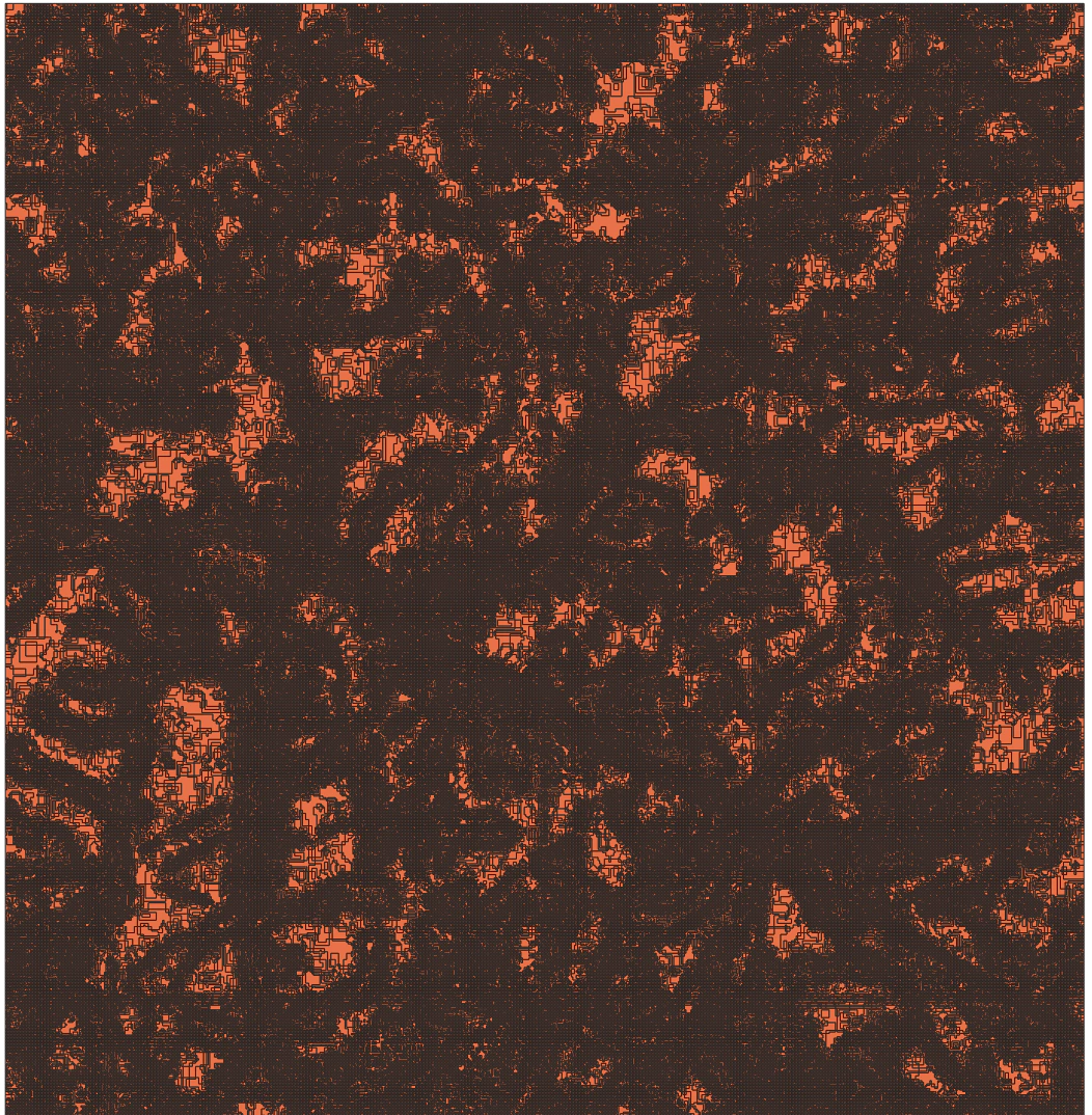
So this is not working very well, the map is over segmented and and we end up with far too many single pixel sized polygons.
With that out of the way we are going to try and improve on this baseline, firstly let’s have try a very simple classifier based on the pixel colour.
Before we go too much further let’s look at the symbology of the geological units.
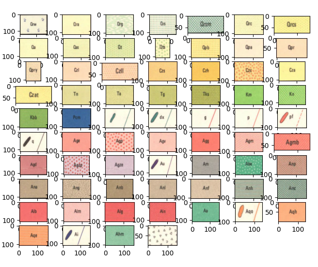
At a glance we can make some assumptions the first being that we should have some level of success creating a classifier that works on a pixel level on colour only.
Using the data we’ve downloaded we will now create a training dataset by looping over each of the map labels and randomly sampling 500 pixels per unit to base our model on.
import imageio
from matplotlib import pyplot as plt
from matplotlib.colors import ListedColormap
import numpy as np

scanned_map = outpath.joinpath('Collie_si5006_Geol_MGA.jp2')
img = imageio.imread(scanned_map)

r, c, d = img.shape
# let's slice out the labelled areas using the .json
train_array = {}
for it,i in enumerate(data['shapes']):
    minx, miny = np.floor(i['points'][0]).astype(int)
    maxx, maxy =np.ceil(i['points'][1]).astype(int)
    ii,jj = np.ix_( range(miny,maxy),range(minx,maxx))
    aa = img[ii,jj,:]
    train_array.update({i['label']:aa})

# we will use a random number generator here to select pixels at random
rng = np.random.default_rng()

# create the training dataset
n_sample = 500
x_tmp = []
y_tmp = []
iters = 0
colors = []
for i in train_array:
    if not i == 'TestSection':
        tmp = train_array[i].reshape(-1,3)
        tc = np.mean(tmp,0)/255
        colors.append(tc)
        r,c = tmp.shape
        rint = rng.integers(r, size=n_sample)
        tmp_labels =np.repeat(iters,n_sample).reshape(-1,1)
        x_tmp.append(tmp[rint])
        y_tmp.append(tmp_labels)
        iters+=1
# make the color map here as we are accessing the slices now
cmap = ListedColormap(colors)
colors = np.asarray(colors)
y = np.concatenate(y_tmp)
x = np.concatenate(x_tmp)
Let’s now fit a model on the pixel level data with CatBoost I’ve recently had a lot of success with Catboost as it’s fast and the default parameters are pretty good.
# classify
from catboost import CatBoostClassifier
from itertools import product
from sklearn import metrics
cbc = CatBoostClassifier(2000).fit(x, y)

yhat = cbc.predict(x)

# make a plot of the pixel colours for each of the stratigraphic units
cm = {0:'r',1:'g',2:'b'}
sidx = np.arange(0,len(y),10)
iter = 1
for i,j in product(range(3),range(3)):
    if i == j:
        plt.subplot(3, 3, iter)
        plt.hist(x[:,i],color=cm[i])
    else:
        plt.subplot(3, 3, iter)
        plt.scatter(x[sidx,i],x[sidx,j],1,c =yhat[sidx])
        plt.xlabel(cm[i])
        plt.ylabel(cm[j])
    iter+=1
plt.show()

print(metrics.accuracy_score(y,yhat))
cm = metrics.confusion_matrix(y, yhat)
plt.subplot(1, 2, 1)
plt.imshow(np.log(cm))
plt.title('Confusion Matrix')
plt.xlabel('True Unit Number')
plt.ylabel('Predicted Unit Number')

plt.subplot(1, 2, 2)
per_unit_accuracy = np.diag(cm)/n_sample
plt.title('Per unit accuracy')
plt.xlabel('Unit Number')
plt.ylabel('Accuracy')
plt.ylim([0,1])
plt.plot(per_unit_accuracy)
plt.show()
We will have a quick sanity check of the performance of the classifier, first we’ll check where the mean colors sit in RGB space, just looking at the distribution of points we can see that Pcm (dark blue) sits clear from all the other clusters in space, so we should expect good performance here, the granites for example all cluster in the same area it’s unlikely that we’ll be able to seperate them.
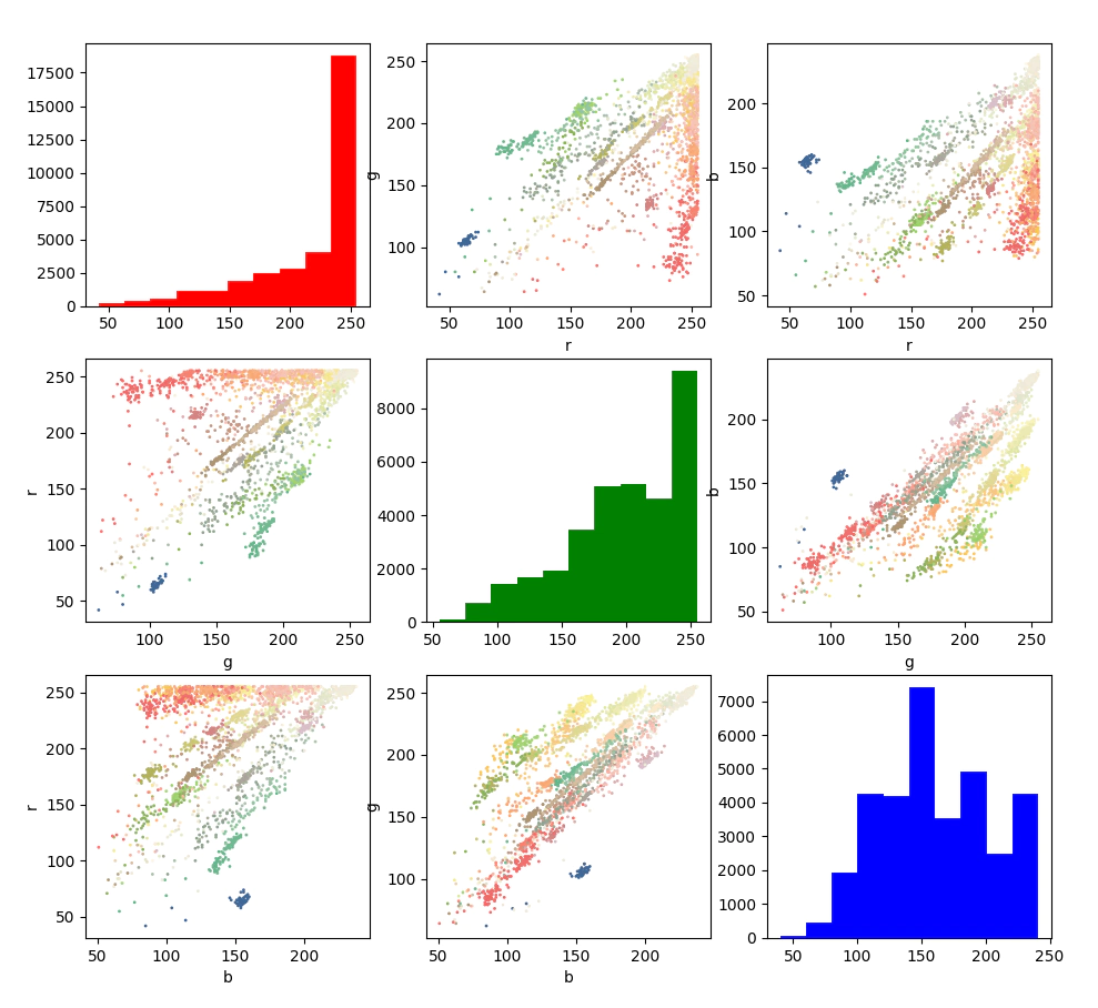
Now we’ll check the confusion matrix and the accuracy per unit
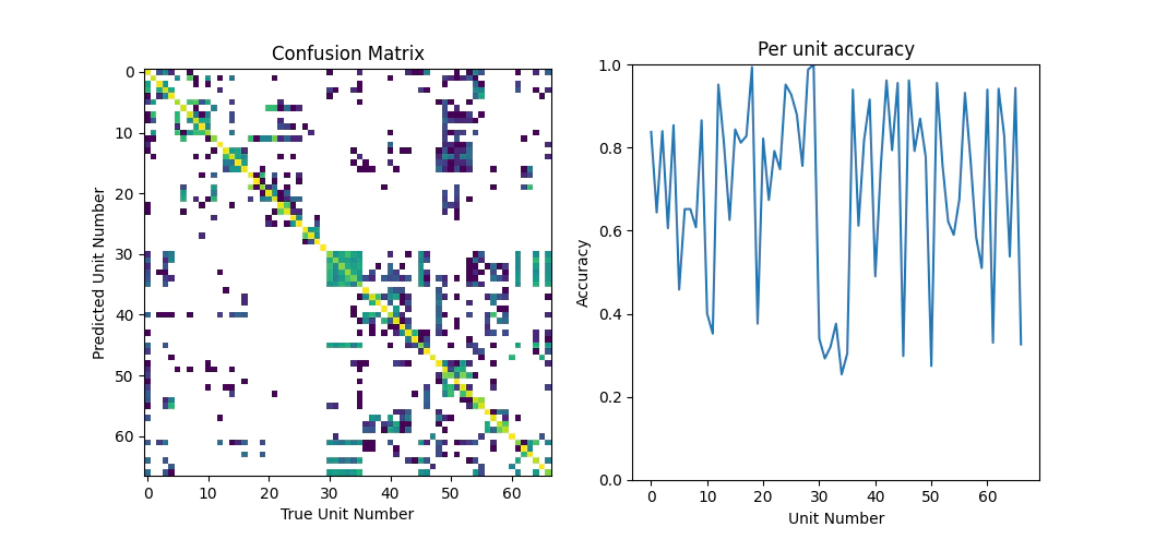
Looking over the classification performance metrics the result isn’t too bad the overall accuracy is around 70%, which is going to be good enough for today.
Seeing as we are very happy with the model as it is let’s now apply it to the test section to see how well it works.
## apply the model to the test section
r, c, _= train_array['TestSection'].shape
ta = train_array['TestSection'].reshape(-1,3)
strat = cbc.predict(ta)
plt.subplot(1,2,1)
plt.imshow(strat.reshape(r, c),cmap=cmap)
plt.title('Predicted Stratigraphy')
plt.subplot(1,2,2)
plt.imshow(train_array['TestSection'])
plt.title('Test Section')
plt.show()
Reviewing the result, it’s better than I would of first assumed as on a per pixel basis we’ve managed to classify decently well and the result is generally nice and smooth.
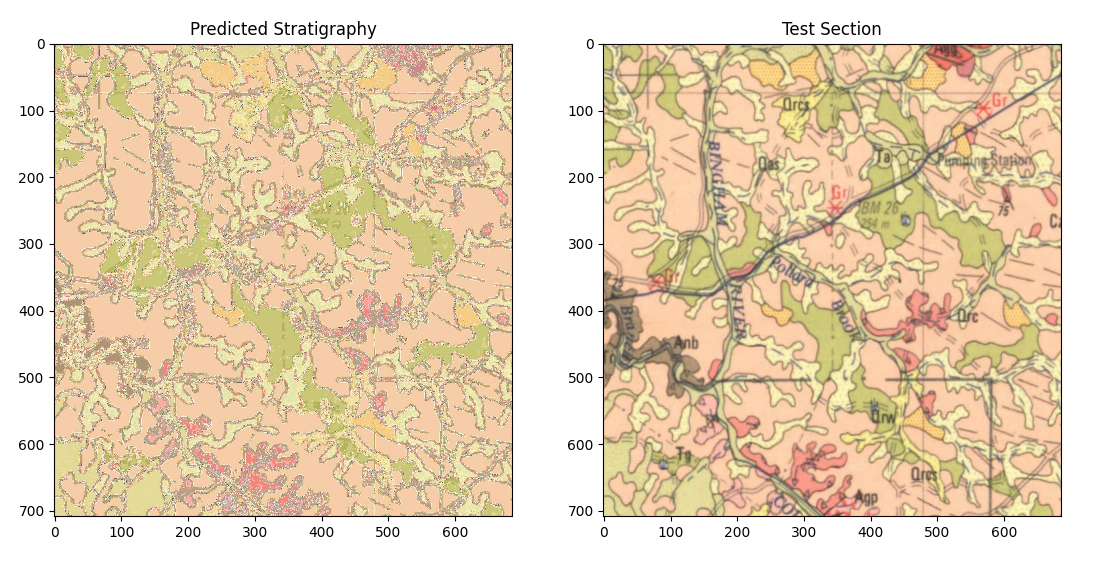
Looking closely at the result we can see that there are some things that are always misclassified, mostly where the lines (grids, writing and boundaries between stratigraphic units) intersect the different units. We still need to simplify the model a little so let’s try that using morphological operations.
from skimage.morphology import area_opening,binary_closing

cl = strat.reshape(r, c)
# count the unique strat units and then reverse sort by number
# then loop over each unit and use binary opening and closing to remove most of the speckle.
values, counts = np.unique(strat, return_counts=True)
sidx = np.argsort(counts)

clean_image = np.zeros_like(cl)

for i in values[np.flip(sidx)]:
    tmp_im = binary_closing(area_opening(cl == i))
    clean_image[tmp_im] = i


plt.subplot(1,2,1)
plt.imshow(cmap(clean_image), cmap=cmap)
plt.title('Smoothed Predicted Stratigraphy')
plt.subplot(1,2,2)
plt.imshow(train_array['TestSection'])
plt.title('Test Section')
plt.show()
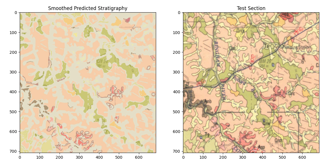
The smoothed result is better but still fails to correctly classify all the units we are interested in, if you were interested you could potentially drop that into qgis and convert it to a raster but I think that we need to do some further work. One of the limitations of what we’ve done here is that we are working only on a pixel color basis i.e. we are not using color+texture, so in the next post we will try and extend in that direction.
Thanks,
Ben.